
Cooledtured Website Redesign: A Research Led Approach
In my time as an intern at cooledtured, an ecommerce platform focused on pop culture, I conducted usability testing on the website and used that information to propose a redesign for many critical pages. I found that website pages were difficult to navigate, inconsistent, and formatted in ways that conflicted with users mental models.

Overview
As a part of my internship at Cooledtured, I conducted moderated remote usability testing with screen sharing to try to improve the website’s flow and design. I found that icon design was inconsistent, spacing was off, buttons were difficult to find, and the gulf of evaluation was wide. From those findings, I created wireframes and high fidelity redesigns of the website to better help users navigate the site.
Cooledtured is an e-commerce platform that sells anime, video game, and pop culture merchandise, while also cultivating an online community. My role as a UI/UX intern was to uncover usability issues in the current site and contribute to a full website redesign based on user-centered research.

Discovery Phase
As an intern, I was tasked with redesigning the website, particularly to accommodate anime enthusiasts who wanted to collect anime toys. I used moderated remote usability testing to extract insights as to how we could improve the flow of this experience. I found that the website was inconsistent, difficult to navigate, and formatted in ways that conflicted with users mental models such that it even resulted in some user’s feeling like the website was “scammy”.
Problem
Users were struggling to navigate Cooledtured’s website, especially when browsing and purchasing products. I was tasked with creating a more intuitive, efficient, and enjoyable user experience, particularly for new visitors who were not used to the site.
Research Methods
I conducted 30-minute usability testing sessions via screen share, where participants were asked to complete key tasks such as navigating the homepage, browsing product categories, and simulating a purchase. I observed their behaviors, asked follow-up questions, and took detailed notes in Figma.
Interview Structure:
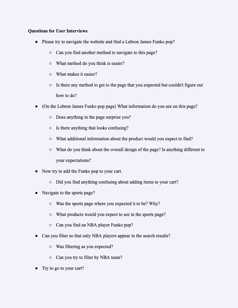
Developed 43 usability-focused questions across 4 categories: Introduction, Navigation, Purchasing, and Wrap-up
Sessions were recorded (with permission) and analyzed qualitatively

Recruiting Challenges:
Finding participants was a major hurdle. With no budget, I relied on creative approaches to outreach:
Messaging Discord servers and Facebook groups
Hanging flyers around student hubs
Asking peers and student employees to participate


Key Insights
I synthesized my findings by writing key insights on figjam sticky notes and grouping them. This was a loose application of affinity diagramming. I also put key insights on screenshots of the website to better be able to visualize users feedback.


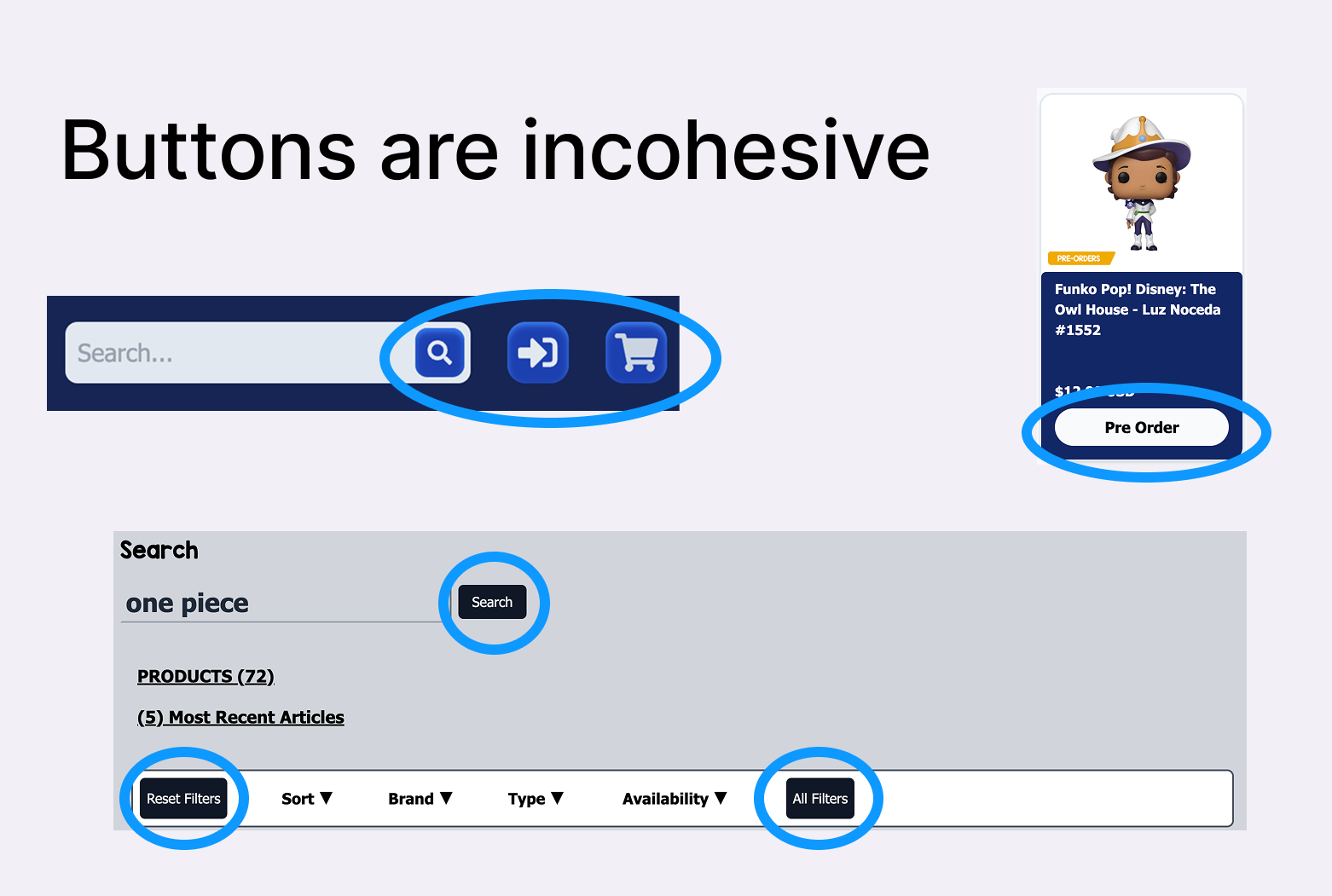
Inconsistency Confused Users
💡 Key takeaway: We found that branding was inconsistent across pages and left users feeling like the website lacked cohesiveness.
The cooledtured website had previously used many fonts and colors which users mentioned made it feel incohesive. One user mentioned that they felt like this made the website feel “scammy”. Additionally buttons on the site all had different styles, with some having a gradient background and others not.

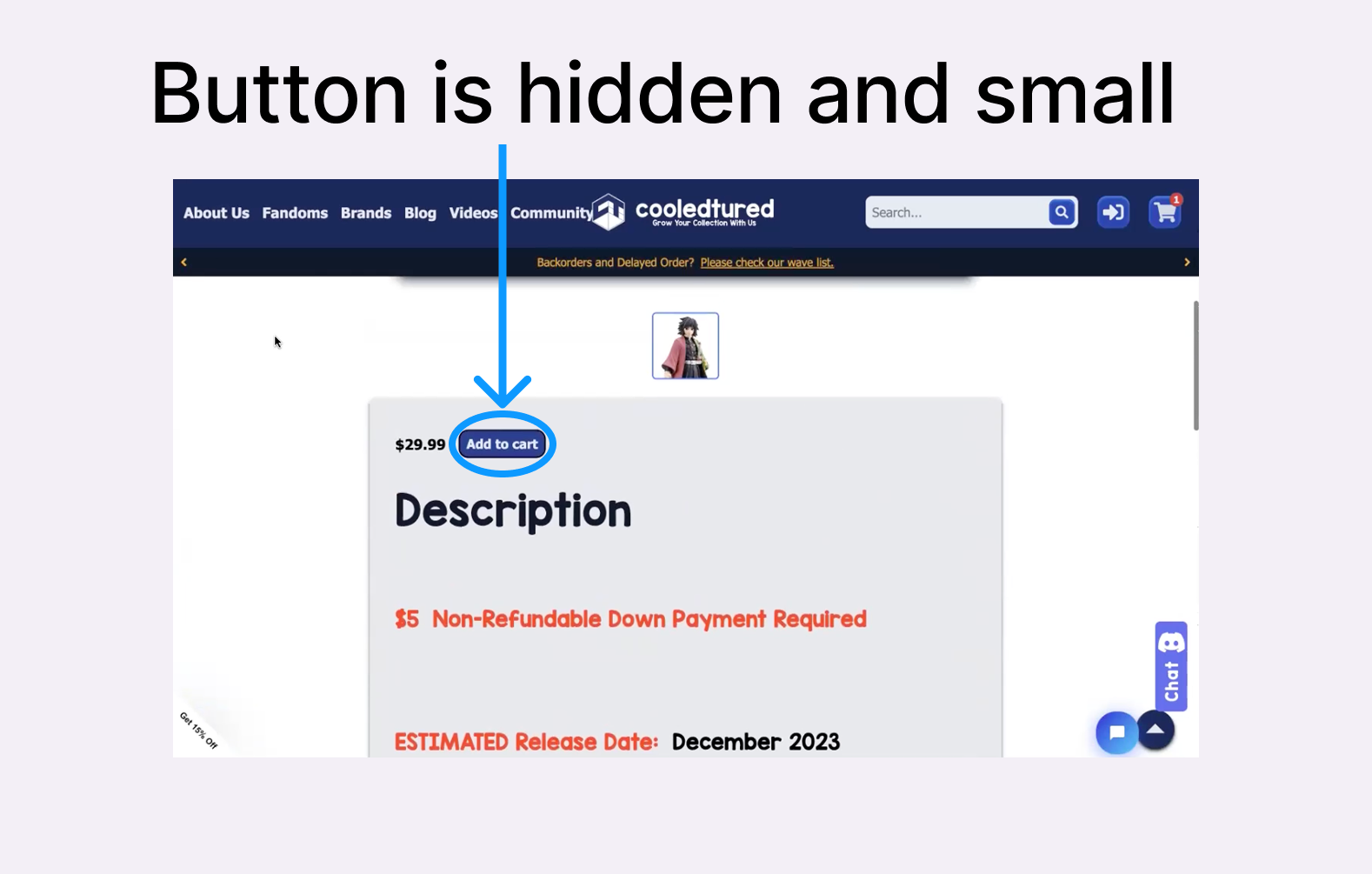
Challenging Navigation
💡 Key takeaway: Users had issues navigating the site and finding key buttons.
We found that users had trouble navigating through the website. For example, multiple users (3) had trouble finding the preorder button because it was small and slightly hidden. One user couldn’t figure out how to pre order items from the product page at all and instead went back and clicked on the button from the product card.
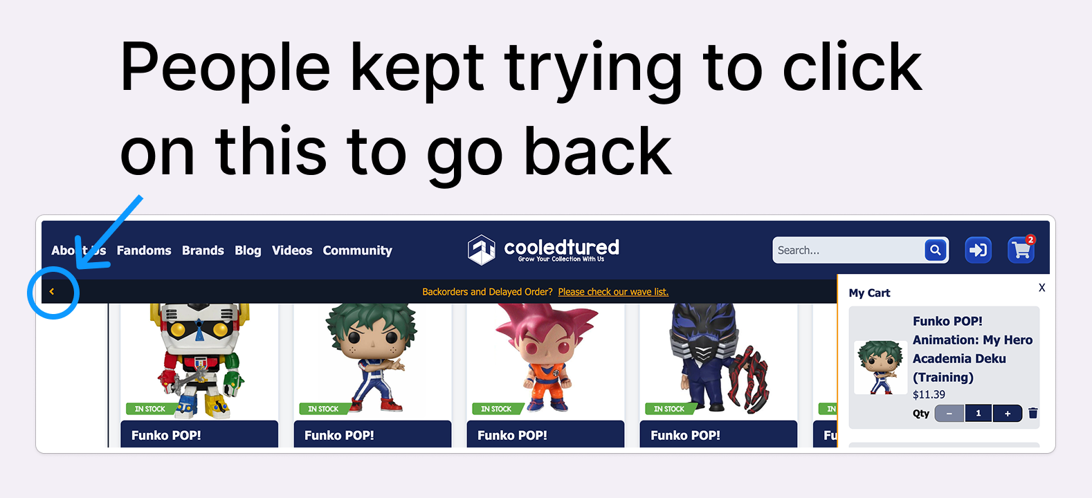
Another example of the websites poor navigation was it’s top banner about backordered items. This is always at the top of the screen and users frequently tried to use it to go back, despite it just alternating between different messages (a delay notice and a covid notice). Users mentioned thinking that it would allow them to navigate back or to another page.
Spacing and Grouping was Off
💡 Key takeaway: Spacing and grouping of website elements conflicted with users mental models and left them confused.
On the product page, elements were spaced out a lot and led to user confusion. 6/10 people interviewed mentioned this specific issue. One user said,
“The spacing is strange. You have to scroll too much.”
Users also mentioned the sizing of elements being confusing. For example, people noted that the product images were too large and took up the whole screen.

The Problem
Our user interviews uncovered a set of issues that I chose to focus on in my redesign. Below I explain the main issue and some more specific pain points.
Problem Statement

People seeking to buy Anime toys on Cooledtured find the website unintuitive to navigate, disjointed, and inconsistent which led users to feel that it was a less legitimate site and drove them away from purchases.
Primary Pain Points
Spacing throughout the website is inconsistent
Buttons were sometimes hidden and hard to find
Users tried to click on various buttons to navigate the website despite them having other purposes
Fonts and colors were inconsistent
Users felt like the website was less legitimate due to its design
Design Process
Based on these user insights, I started to map out new designs for various pages of the website.
Wireframes

I started out by creating wireframes for both desktop and mobile. Some of the general changes are below.
Fonts and colors to be more consistent
Image quality was made to be clearer
Removed confusing navigation elements
Changed the navigation bar to be more simplified
Going into some of the pages, I explain some of my changes below.
Home page to be less overwhelming by removing certain sections and adjusting the spaces of elements
Product page to show users all necessary information without scrolling and have a new similar products section
Brand pages to be more simple and less overwhelming
Filters to be more useful and allow for many filters at once
Search functionality to include autocomplete and suggestions
High Fidelity Prototype

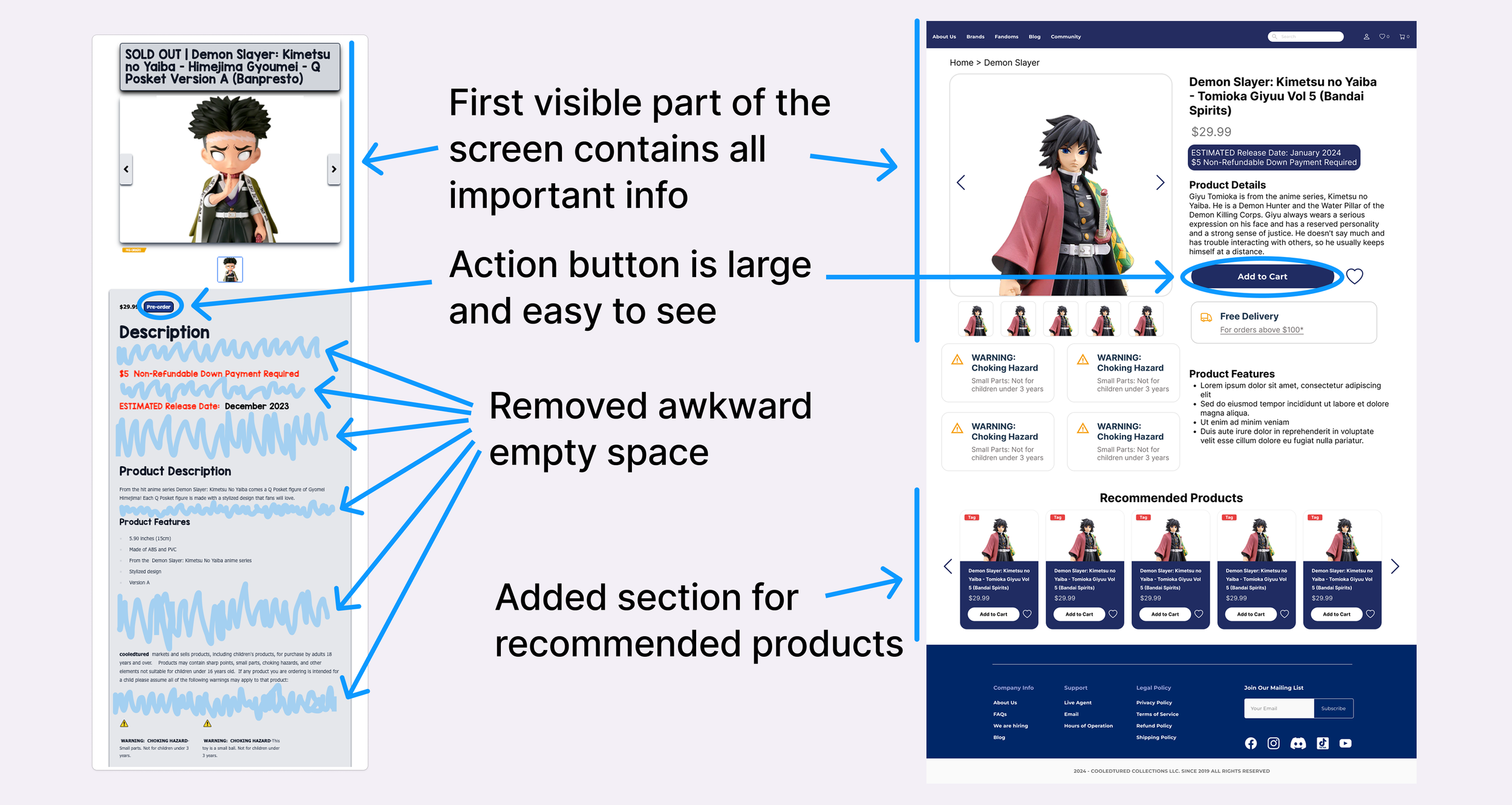
Like with the wireframes, I created both desktop and mobile versions of the screens. With these designs, I mainly prioritized implementing what I had changed in my wireframes. Let’s look specifically at the product page as a comparison.
Reflection
Research Constraints Help Direct Projects
Conducting open ended interviews gave participants the freedom to explore the site naturally, but I found that it also made synthesizing the data more challenging. Without tighter task boundaries, it was harder to focus findings around key themes. This experience taught me that scoping research sessions can make it easier to prioritize insights and deliver more actionable recommendations.
User Motivation and Trust in Recruitment
Recruiting participants without offering incentives taught me a lot about trust. Users are understandably hesitant to engage with unknown researchers. In future projects, I plan to build trust faster by leveraging known communities more strategically, offering incentives when possible, and being even clearer about session expectations up front.